A “New Normal” Is Here. Is Your Website Ready For it?
If nothing else, these last few years have taught many businesses (including our own) the importance of having a strong, dependable, and adaptable team. An important member of that team for SMBs is their website. It plays the role of Salesperson, Customer Service Representative, and Marketer—all at the same time.
As you take a fresh look at your website, here are 3 things that your website should be doing:
1 – Make Sure Your Website Works Well On Mobile. Seriously!
By now, we’d hope that most businesses know that they need a responsive website. Many companies have one, but there is a difference between being responsive and being effective on mobile.
When was the last time you visited your own site on a phone? We’ve worked with a lot of clients whose answer is “almost never.” These clients are surprised when they finally look at the site on their phone and find that the navigation doesn’t work well, images don’t load, or readability is an issue. We worked with one company where the chat functionality they added worked great on desktop but actually blocked the submit button on their form on mobile. No wonder their leads were down!
A good website on mobile is critically important for a few reasons:
- Mobile-first Indexing. Google uses the mobile version of your site for indexing and ranking, which means poor load times or a bad experience on mobile may mean your customers have a harder time finding you.
- More Consumers are Buying on Mobile. According to Business Insider, 2022 is predicted to be the first trillion-dollar year in online sales — yes, trillion, with a “T.” Half of that will come from mobile purchases! Over the years, your business has more than likely seen the percentage of mobile site traffic steadily increase, but you should no longer assume these users are ‘just researching’ and will turn to a desktop device to buy.
- Consumers Are Not Forgiving Of A Bad Mobile Site. Invision, a design software company, shared some startling statistics about user experience, and two really caught our attention. One, 85% of adults think a company’s mobile experience should be as good or better than desktop, but for so many companies the mobile experience is an afterthought. The second stat was that 88% of consumers are less likely to return to a website after a bad experience. This could mean lost leads, lost customers and lost revenue!
2 – Make Buying Easier
The pandemic accelerated the shift to digital shopping by 5 years and there is no turning back. If that’s true, why do so many websites make it so difficult to buy?
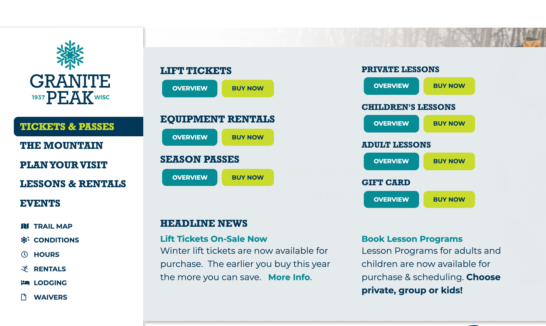
We love how SlopeFillers, a blog from Inntopia, recently described the twists and turns many websites send users on to actually make a purchase: “We make this harder than it needs to be for our guests when we force people who just want to buy a pass to click ‘Tickets’ then ‘Buy Tickets’ and one last ‘Buy Now’ before hitting our booking engine.”
Whether you’re selling products directly through your website or you leverage a third-party booking system, the key to preventing users from going on a wild purchasing goose chase comes down to two things:
- Know your customers and what they’ll need to help them make the purchase decision
- Have a website user experience (UX) that makes their journey intuitive and simple
We recently built a new website for Wisconsin ski resort Granite Peak. During the UX phase, we made sure we understood their two main customers-types: the Initiated (skied there before) and the First-Timer. We created distinctly different user-flows for each group, making sure First-Timers could easily find information about costs, lodging and terrain before being directed to the third-party booking engine via prominent Call-To-Action (CTA) buttons.
2.5 – Still Make Buying Easier! Even If You’re Service-Based or Brick-and-Mortar
Buying is a process, so even if the final purchase happens offline, the information-gathering and evaluation steps still happen on your website. Make it easy for your customers to find what they need so they’ll become a lead or come to your store.
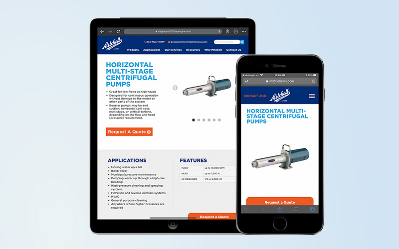
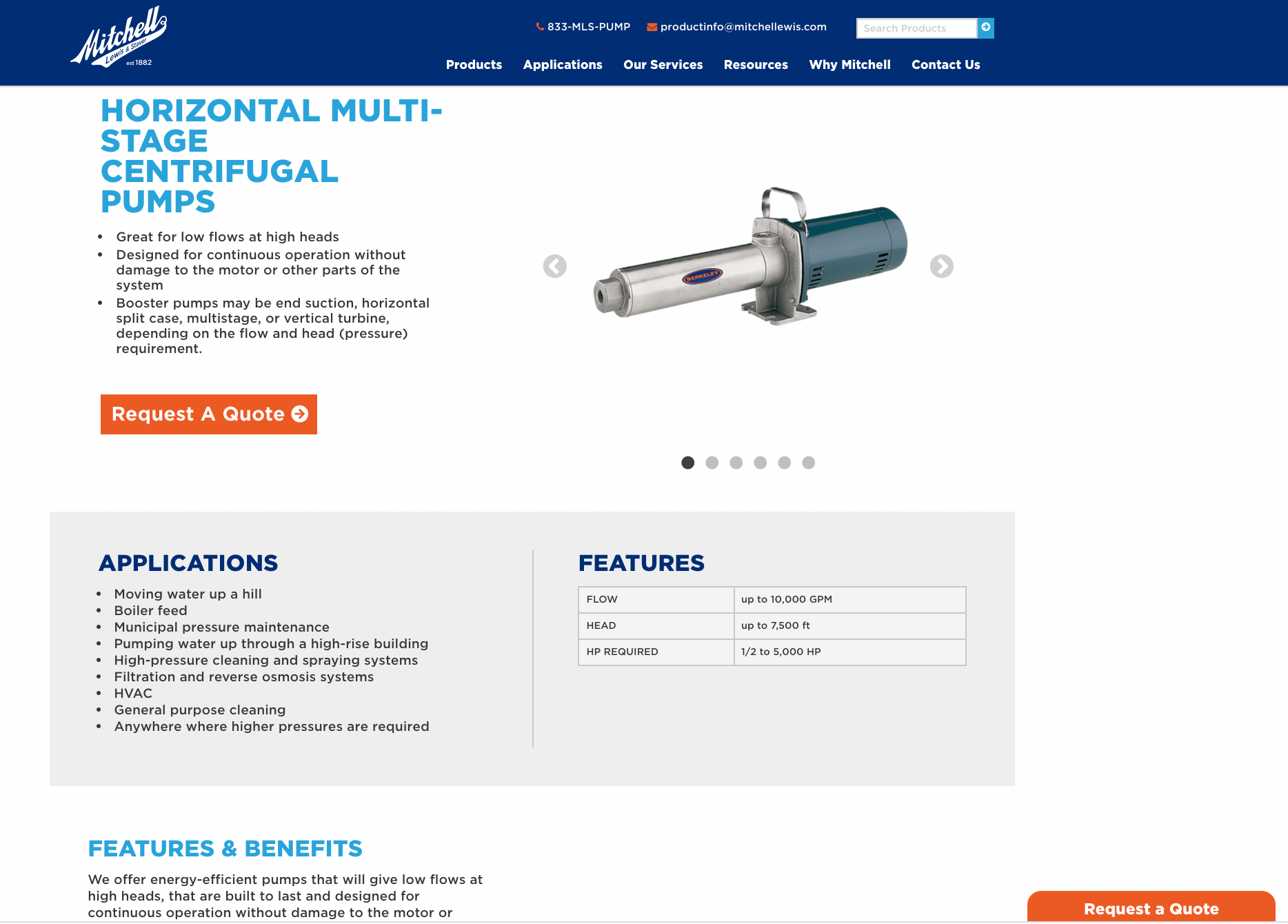
Even though a business may not sell their products online, most customers still visit websites for information. Our client, Mitchell Lewis & Staver’s old website sent customers to PDFs, downloadable catalogs and even manufacturer websites to find product details on commercial and residential water pumps, motors and controls.
In order to make this research more efficient, we built their new website like an e-commerce site. We created product pages—just like you would find for online retailers—that had descriptions, specifications, product photos, and information all in one place. And like e-commerce sites, we included strong CTAs—the only key difference being these encouraged users to “Request A Quote” and not “Buy Now”.
3 – Make Your Site as Adaptable as You Are
The need to communicate COVID-related changes to your business isn’t a thing anymore. But the need to get timely and important information to your customers will always be there since sales, promotions and business hour changes are always going to be a part of running your company. Making sure this information is easy to find and can be added quickly usually requires a bit of planning to “expect the unexpected.” That is why we built several places on the new Granite Peak website for them to share important updates.
The first thing we included was an Alert Bar at the top of their site. This can be used for anything from announcing their season opening date to letting skiers know about changed schedules due to extreme weather or holidays. The nice thing about this alert bar is it’s totally optional—if there isn’t any breaking news it simply disappears!
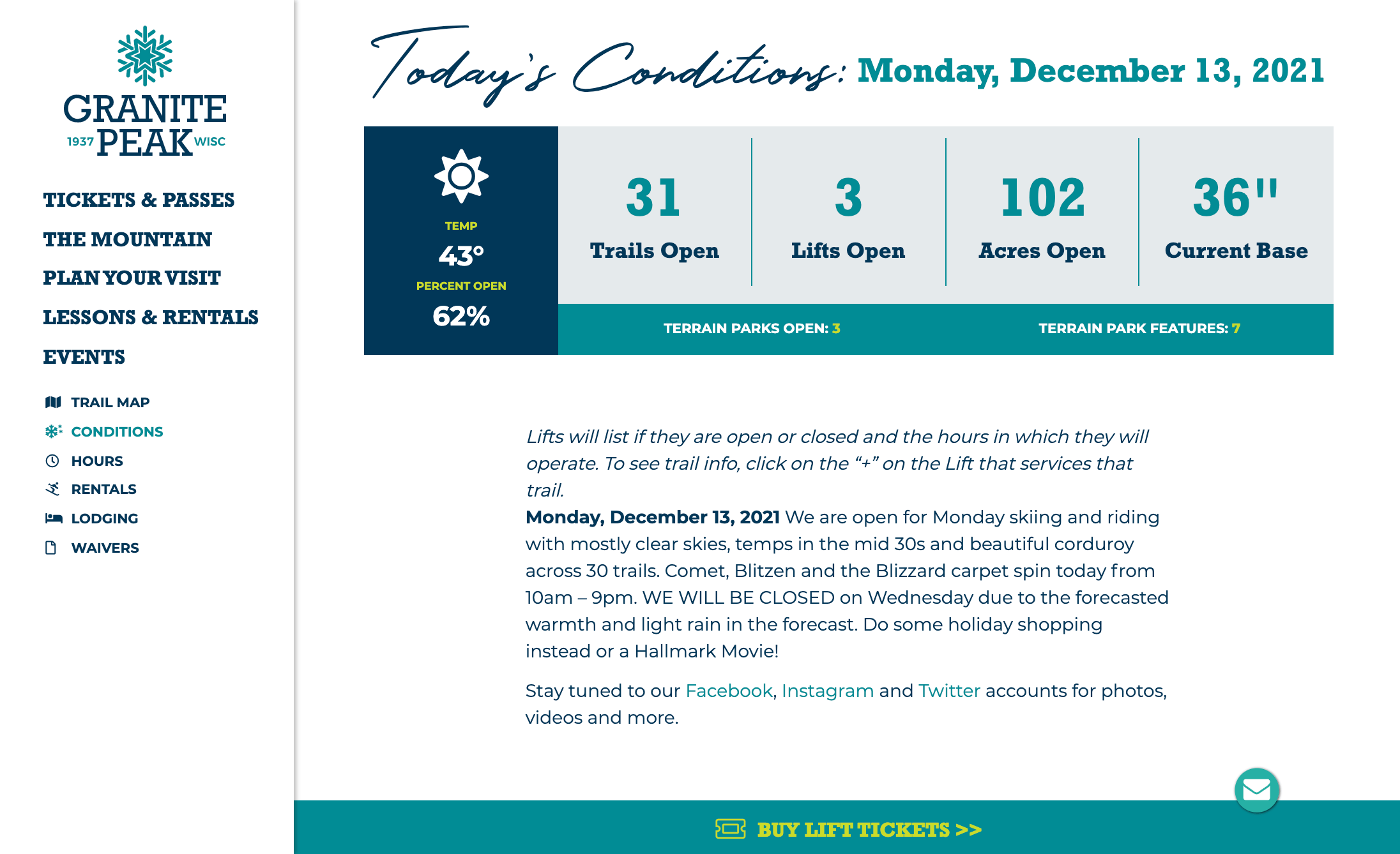
Understanding that most website traffic was to the Home and Conditions pages prompted us to provide a promotional call-out in the Tickets & Passes mega-menu to ensure visitors weren’t missing out on resort promotions or fun events, called out in the “What’s Happening” section on their homepage. The Conditions page had a place for including timely resort information and highlighting upcoming events.
———————
We don’t want to see any small or medium size business being held back by a less than optimal website. Take a critical look at your site today and see if it’s able to do these 3 things. If you think it can be improved, give us a shout at hello@fish-marketing.com and we’d love to do an assessment for you!
Navigating this changed consumer climate may also mean a change in marketing strategy. We’re here to help with that, too. As a full-service agency, we love helping small businesses with everything from developing marketing strategies to creating beautiful advertisements and getting your message in front of your customer via digital and traditional channels. We hope to hear from you!


