A new look and a look behind the scenes.
It’s official! Our new site is up and we’re down to share it around. Get the feel for our new online hub, then get the scoop from a few of our key Fish team members.
Nate – VP of Brand Leadership
What was the main goal of the new Fish brand and site?
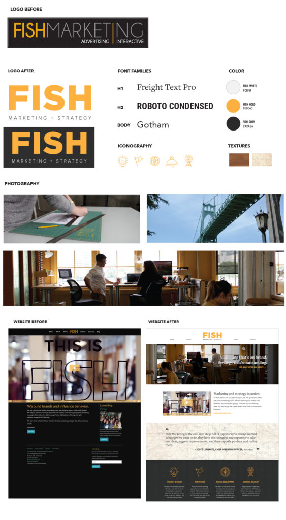
We needed to reposition Fish as one of Portland’s top full service agencies. Our old logo and website showcased where we’ve been. We needed a new look to demonstrate where we are at and where we are going as an agency.
What’s your favorite new feature?
I’m kind of a nerd, so my favorite feature is the improved UX and mobile functionality. Oh, that and the animated icons on the homepage. They’re simple, but cool.
David – Lead Web Developer
What was the most challenging part of building the website?
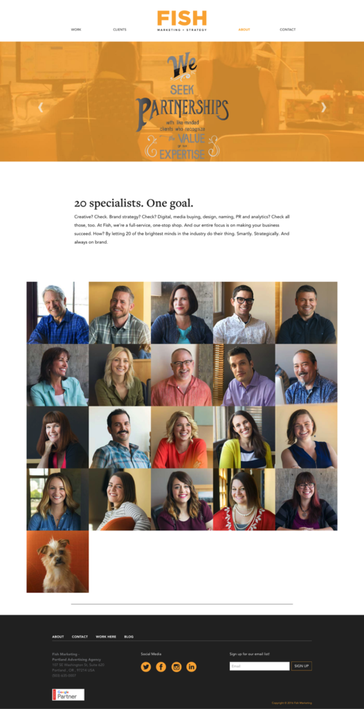
Building the About/Staff page was a challenge. It’s packed with content and images that are revealed so it had to be organized and easy to edit in the admin; quick to load; and the presentation adaptable for responsive views. A lot of moving parts that need to transition well together. Similar code base is used for the Work/Portfolio presentations.
What is your favorite feature?
The staff and portfolio expanded views.
Lacey – Brand Director
What was the brand strategy going into this project?
Fish has several key differentiators – a full service marketing agency with very talented and smart people, access to the best media planning and optimization tools, a Premier Google Partner – just to name a few. Our new site better communicates those differentiators effectively and creatively.
What’s your favorite new feature?
The Work pages… and the navigation icons at the top of them.
Take a look for yourself:
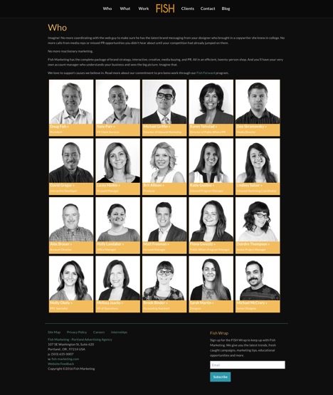
About Page – Before
About Page – After


