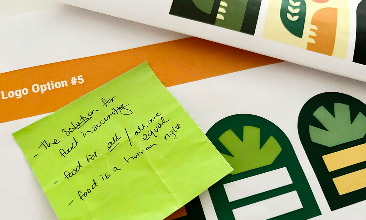
A thoughtfully designed logo is more than just a visual emblem; it’s the heart of an organization’s brand identity. For nonprofits, where mission and message are a huge part of their identity, a logo can immediately communicate purpose and inspire confidence in the community they serve and the general public.
This year, Fish was proud and excited to work with Urban Gleaners, a Portland nonprofit that gleans food from high-end grocery stores, businesses and farms, then distributes it via free food markets in the local community to anyone experiencing food insecurity.

Our Art Director, Meghan Verhey, took on the task happily, as we’re always excited to work with companies that align with our values. We got a little peek behind the scenes at her process in this interview.
Q: How do you approach logo creation?
A: With an open mind. Each client is different, so starting the logo process with a clean slate is key. I try my best to not foresee a specific direction before I have a complete understanding of the client and their goals as a brand. Once I have a handle on the scope, I start brainstorming concepts: what elements or objects best represent them, what styles/aesthetic has the right look and feel, what their competitors are doing – and most importantly, how do all of these pieces fit together? Then I filter, fine-tune some initial ideas, and adjust them into viable concepts. I also like to provide concepts that cover three buckets:
- safe/tried and true
- slightly outside the box/outside their comfort zone
- unexpected/unconventional
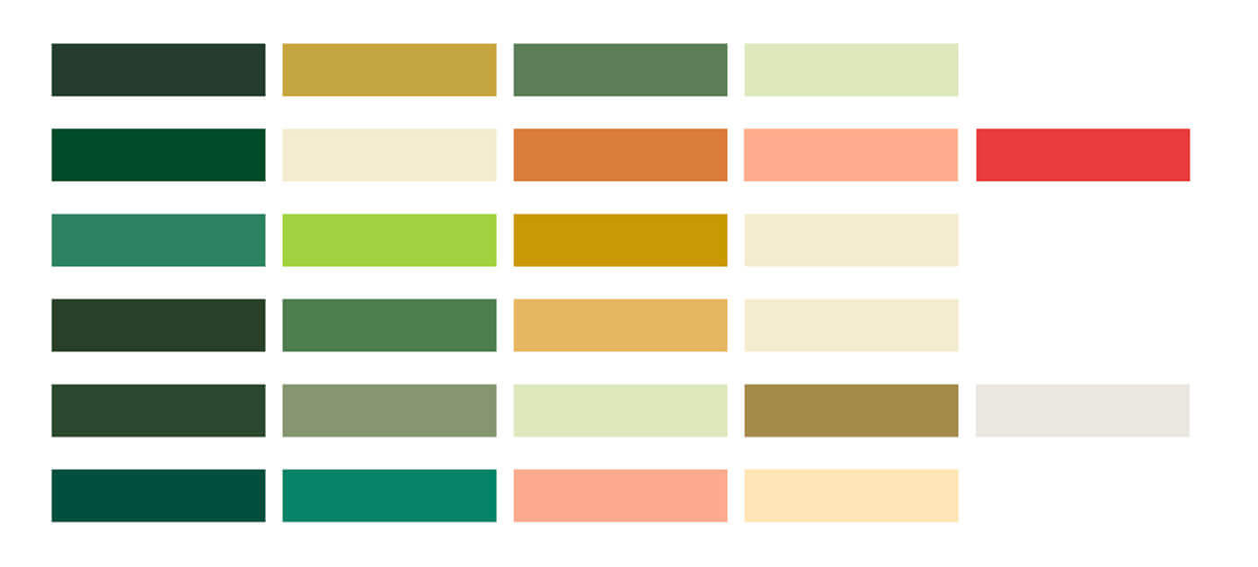
A color study for Urban Gleaners
Q: What was the first step in the logo process?
A: We engaged in an in-depth brand discovery exercise with key team members to understand the mission, services, goals, and what the future holds as they continue to grow.
Together, we discussed everything from their brand personality and characteristics, likes and dislikes (from their own logo, and other businesses), potential colors and styles, and how they want to be perceived as a brand. This full-circle understanding gets the logo process off on the right foot; leading to a logo that works on all levels – now and well into the future.
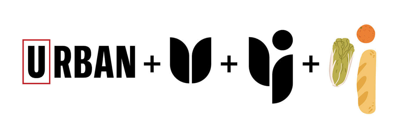
An early draft of the elements of the next Urban Gleaners logo
Q: How do you know a draft is in a good enough place to move forward in the process?
A: I know a draft is in a good place when I revisit it after a day or two and still feel strongly about it. Stepping away allows me to see it with fresh eyes, highlighting ways to improve the concept, layout, scale, and positioning. I know I’m getting close when I start viewing the concept with excitement, not with a critical eye like it’s a problem to solve… or when I stop having nagging thoughts in the middle of the night about how it needs to be tweaked to be more effective. It’s definitely a gut feeling – and it’s a wonderful feeling to pull a concept from the depths of the endless artboard variations to a more “official” spot, declaring this as the ONE.
Q: Are there steps you can take that help you decide if a logo will ultimately work (I.e. mocking up signage and swag)?
A: The best way to decide if a logo will ultimately work is to put it through the wringer.
- SIZE: scale it up, scale it down and everything in between. Can it be just as effective on a billboard as on a business card? What about as a profile image or favicon? Keeping scalability in mind during the design stage makes sure the end result is suitable across sizes and mediums.
- APPLICATION: will the logo print well and look sharp on screen? How does it look in black and white, or as a single color? Light backgrounds, dark backgrounds? All these boxes need to be checked.
- USAGE: I like to take testing a step further by showcasing the logo in various types of usages. Creating realistic mockups like apparel, signage, packaging and more, you can start to see the logo and overall concept come to life.
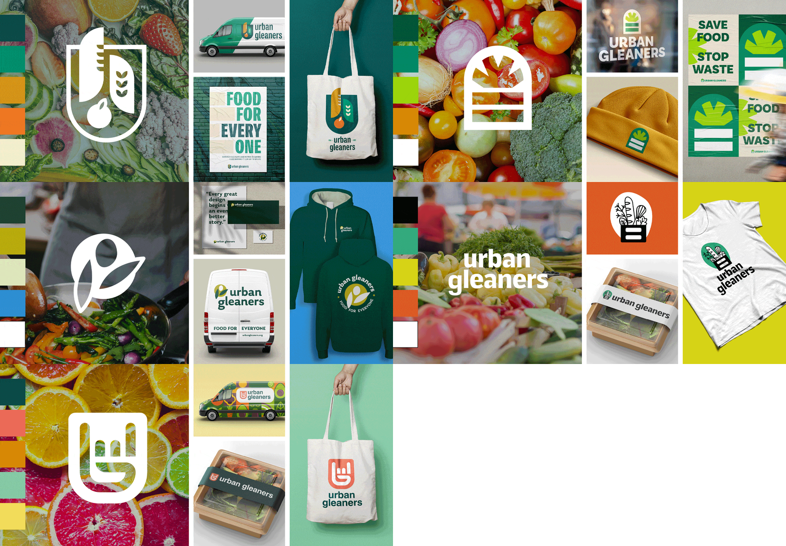
Logo Usage Experiment
Q: Are there ways to create a shared language with the client around feedback?
A: I use clear and consistent communication as soon as I start working with a client. This includes a set of common terminology that is used to discuss logo elements and details – while keeping designer jargon like “kerning” or “tracking” to a minimum. I try my best to be thorough with communication and labeling throughout the process so that the language will become familiar and understood by both parties.
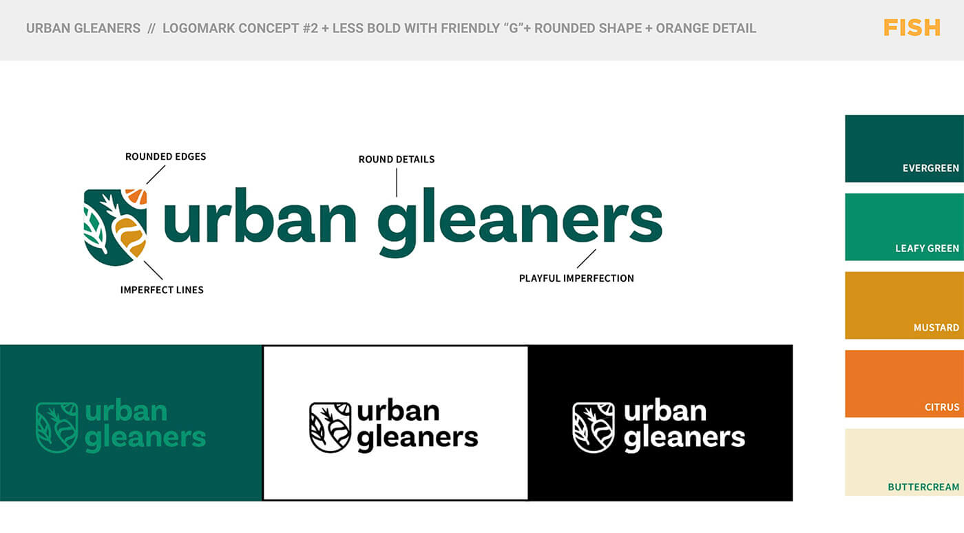
Urban Gleaners Logo Presentation
Q: What’s the hardest thing about creating a logo?
A: The task itself: develop something new, fresh, unique, amazing in every way, that will forever represent this company….that’s a lot of pressure to put on one single element. And the hardest part is getting started. You can do all the research and prep in the world, but actually jumping into the creative process can feel like a daunting endeavor. Your mind is swimming with ideas and you’re armed with inspiration and information, but now it’s time to put pencil to paper (er, mouse to screen?). The good news? The “hard part” is over as soon as you start working. Not every idea you have in your head will pan out, but the time spent actively designing leads to so many more.
Q: What was the process like with the Urban Gleaners team?
A: It was absolutely fantastic. What really stood out to me was their passion about what they do and their excitement to be part of the logo process – it was contagious on both fronts and served as a real source of inspiration. They were collaborative and receptive which helped make the project run smoothly from start to finish. It was a true partnership and I think it shines through when looking at the final outcome.
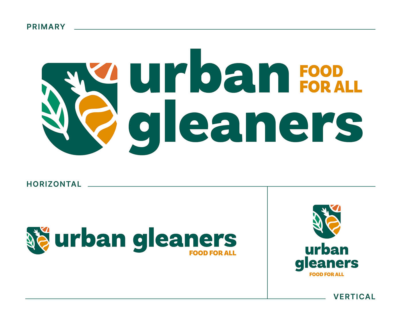
Urban Gleaners final logo family
A new logo can feel like a huge undertaking, but it doesn’t have to be. With a collaborative team, clear goals, and a structured process, it can be an exciting and sometimes even illuminating exercise!
Thinking about refreshing an old logo or creating a brand new one? Contact Nate nate@fish-marketing.com and he’d be happy to talk to you about how Fish can help.

