Branding
A strong brand is your company’s secret sauce. It can turn strangers into fanatics and skeptics into evangelists. But it’s not built overnight—it’s cultivated with consistency, personality and a dash of daring. We can do that.
A strong brand is your company’s secret sauce. It can turn strangers into fanatics and skeptics into evangelists. But it’s not built overnight—it’s cultivated with consistency, personality and a dash of daring. We can do that.

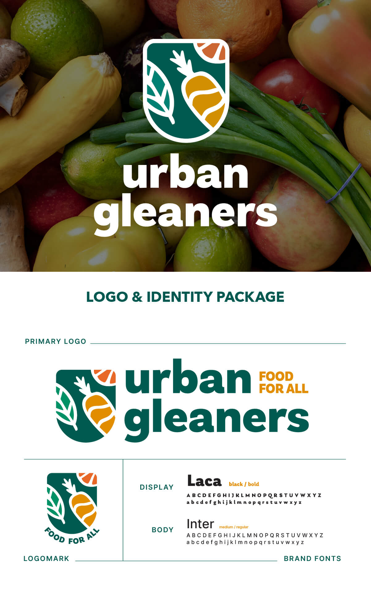
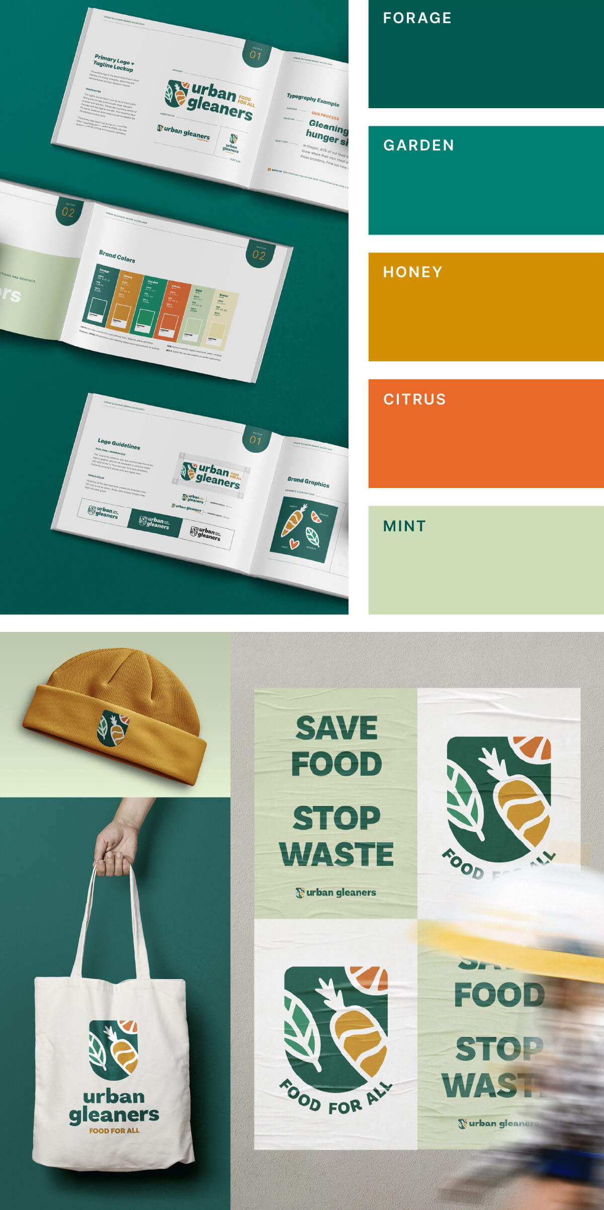
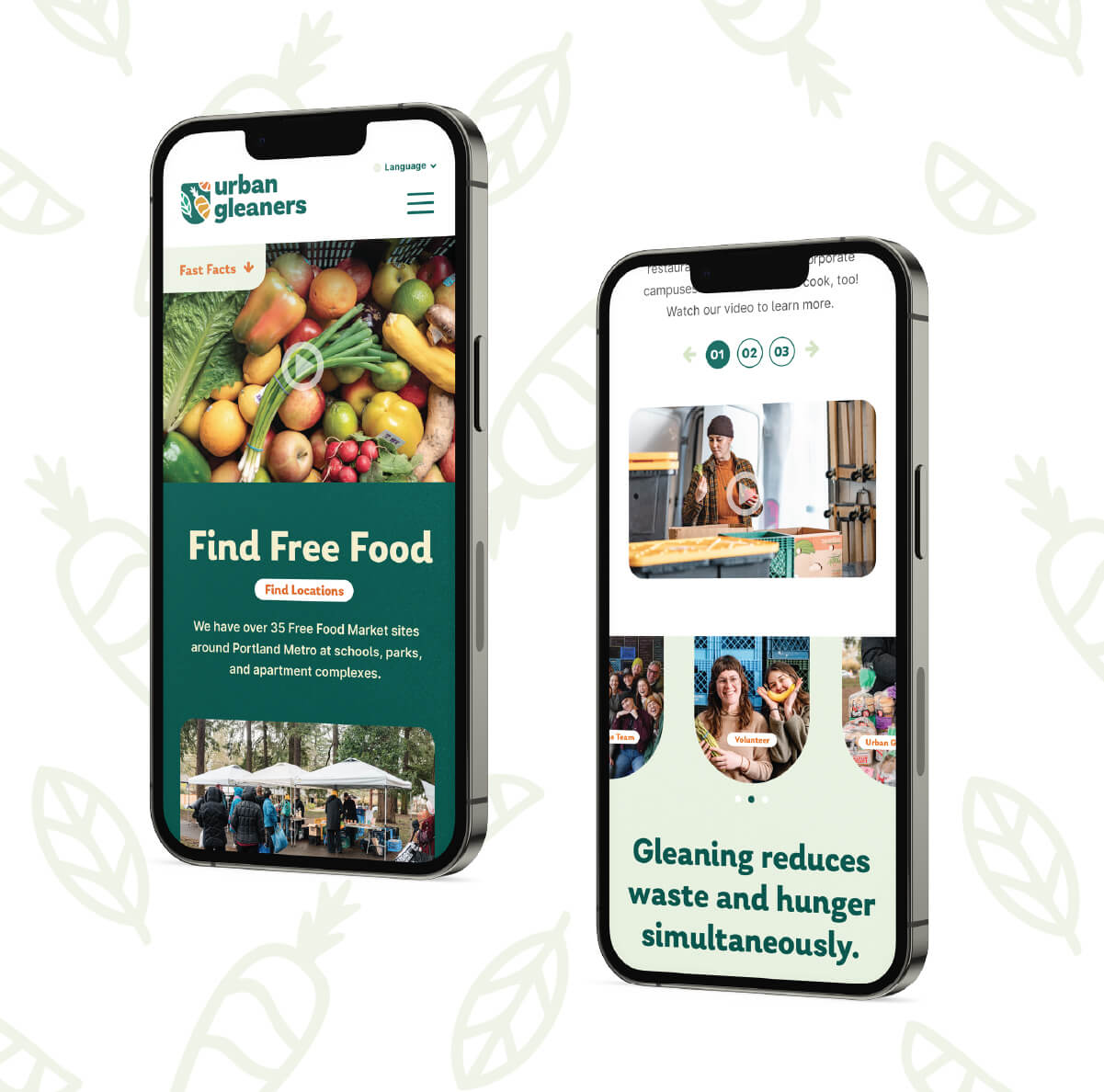
Here at Fish, we're passionate about helping organizations tell their stories in impactful ways. That's why we were excited to work with Urban Gleaners, a non-profit dedicated to tackling food insecurity and climate change, to revamp their brand identity. Through an in-depth brand discovery phase (which of course included a taste test), we created an approachable, and friendly logo that captures the essence of their brand. This new look is not just a fresh coat of paint—it’s a symbol of their ongoing dedication to providing our community with nutritious meals and reducing food waste.
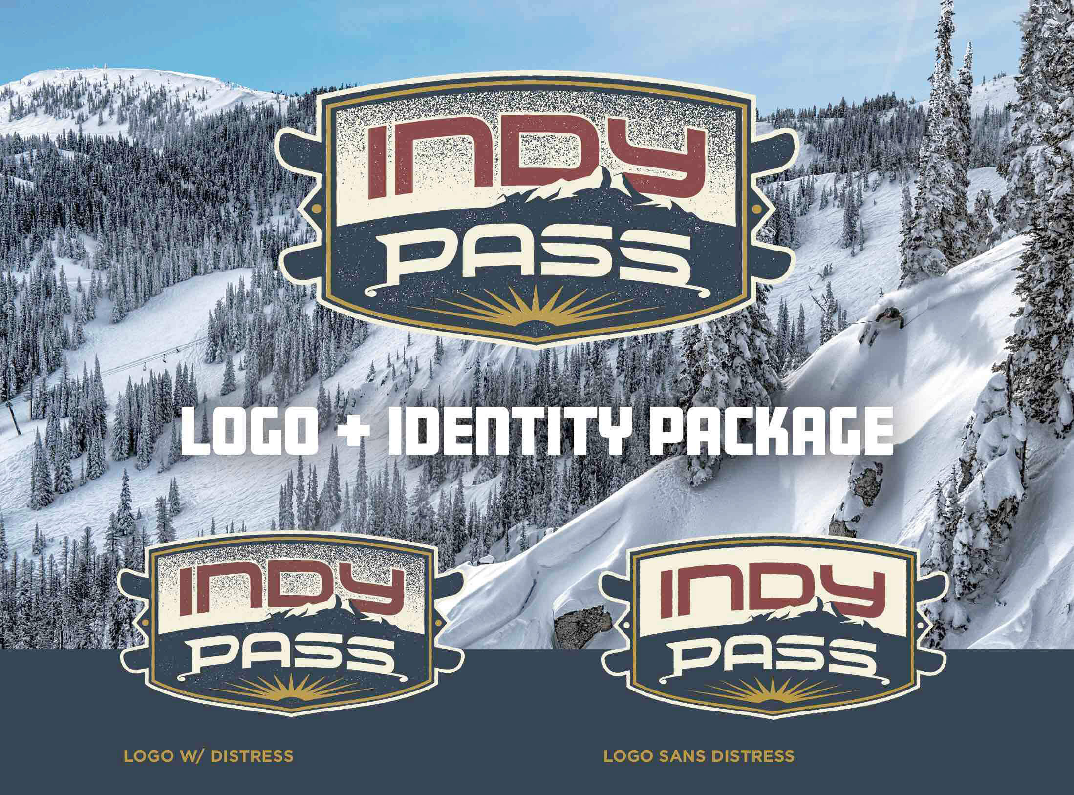
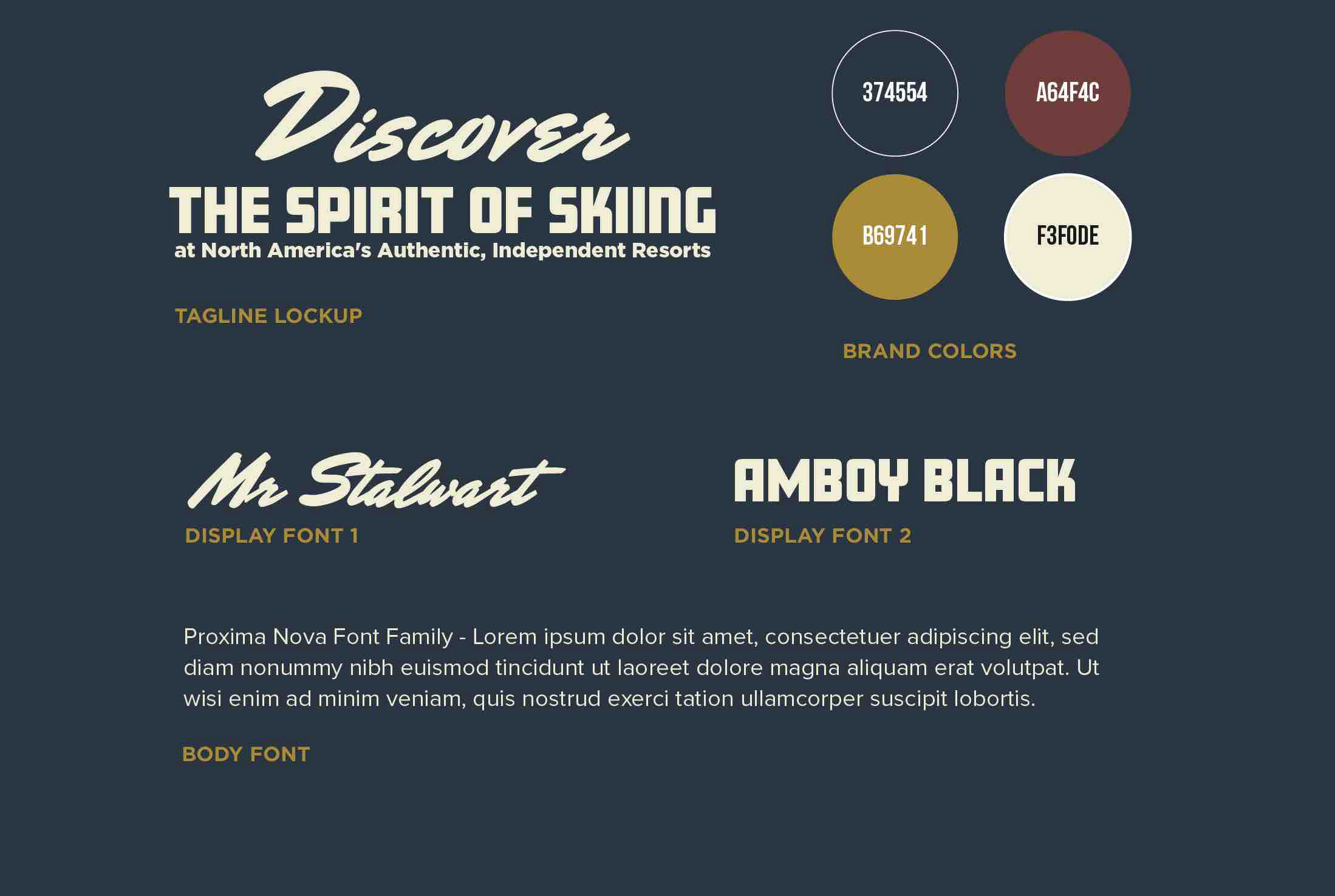
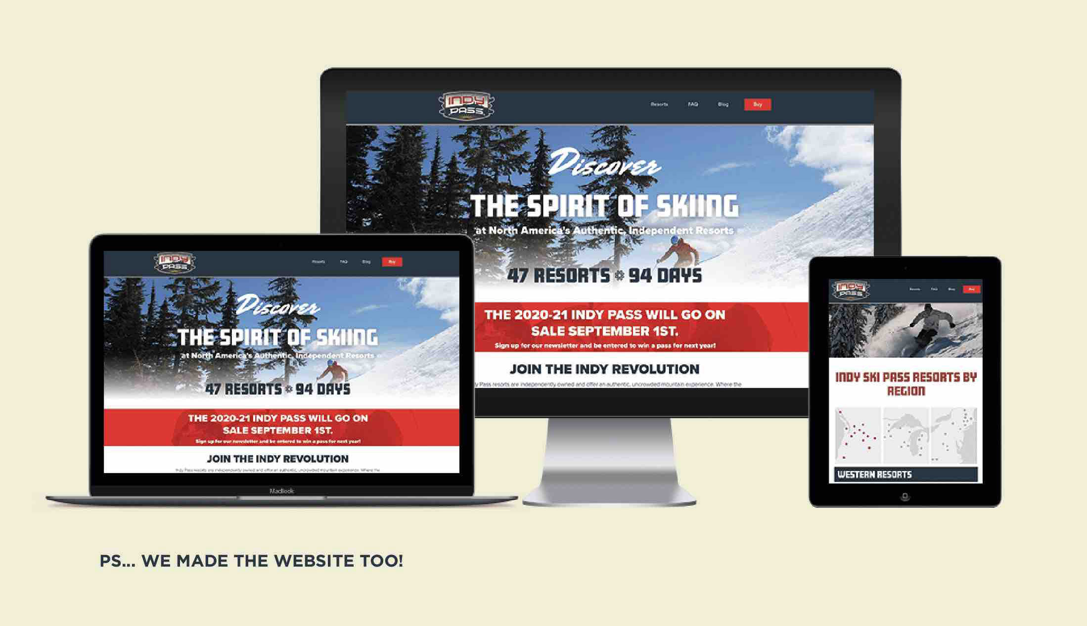
Since FISH launched the Indy Pass in 2019, it has become the fastest growing multi-resort ski pass in the market. The Indy Pass allows pass holders to get two days of skiing or riding at 180+ ski resorts across the U.S., Europe, Canada, and Japan. Resort partners are exclusively independent, small ski areas that provide an authentic and unique experience, so the logo needed to reflect an indy vibe.
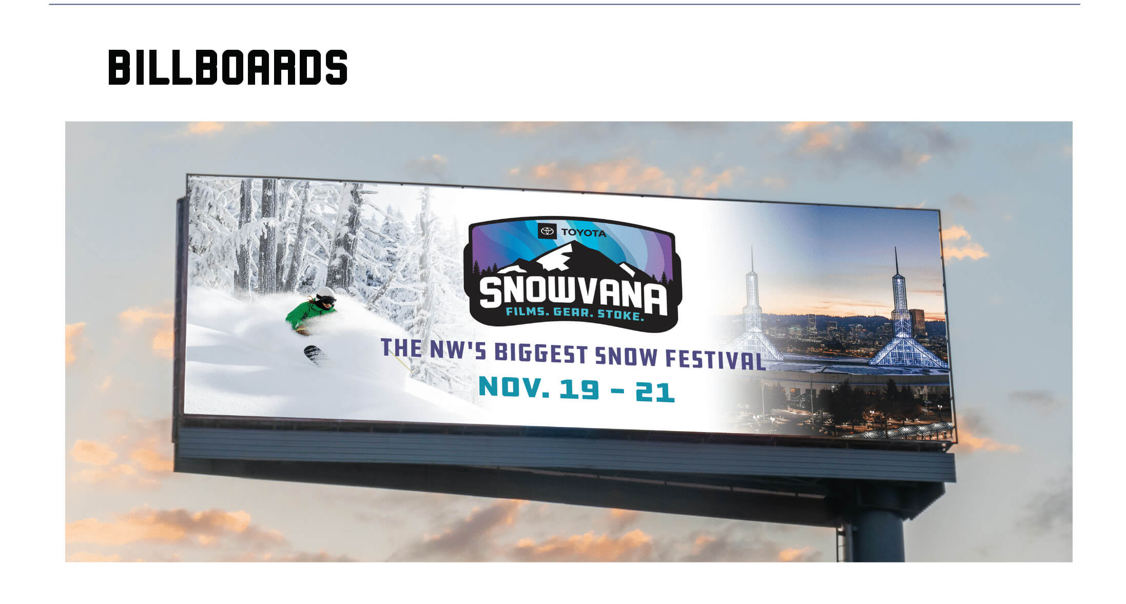
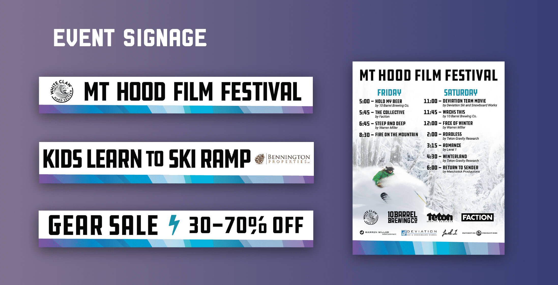
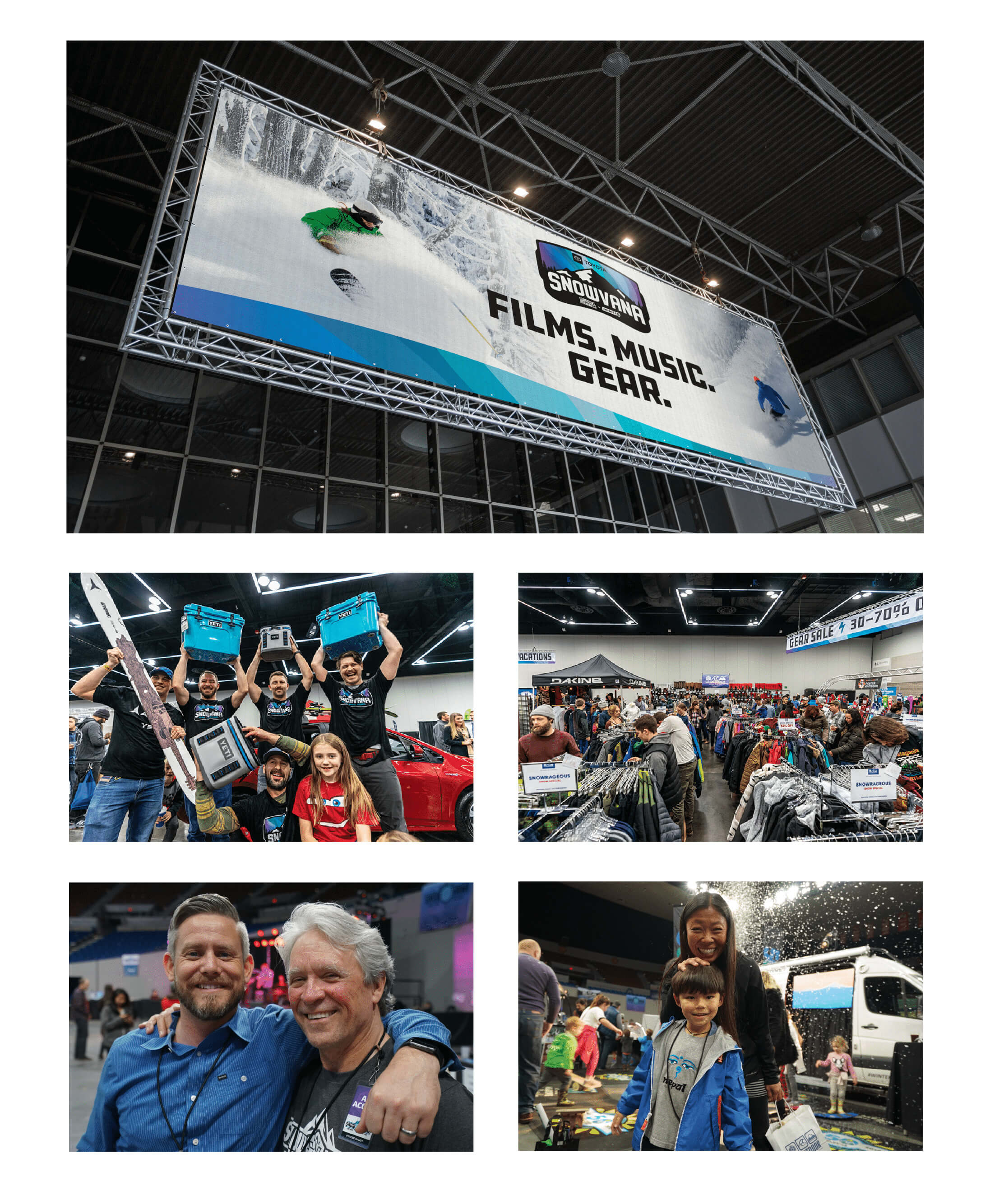
Snowvana was created by FISH Marketing as a new kind of event to kick off the snow season. Snowvana is an entertainment festival with everything a snowsports enthusiast loves – ski and snowboard films, live music, the latest gear, and a brew fest. FISH leveraged our expertise in branding, digital and traditional advertising, and event promotion to build this fresh new concept from the ground up. It was so successful, we're looking to expand to multiple locations in the coming years.

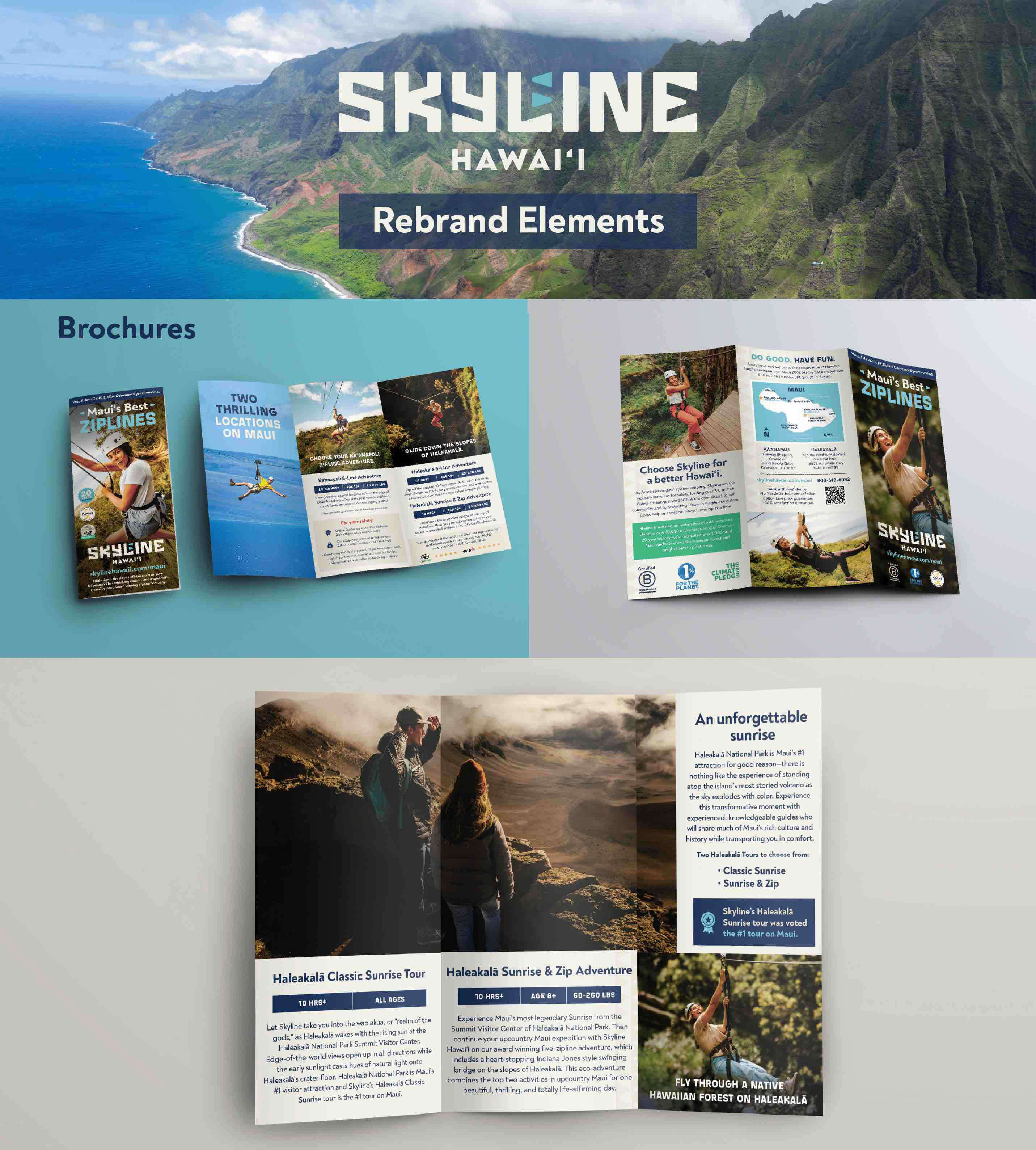
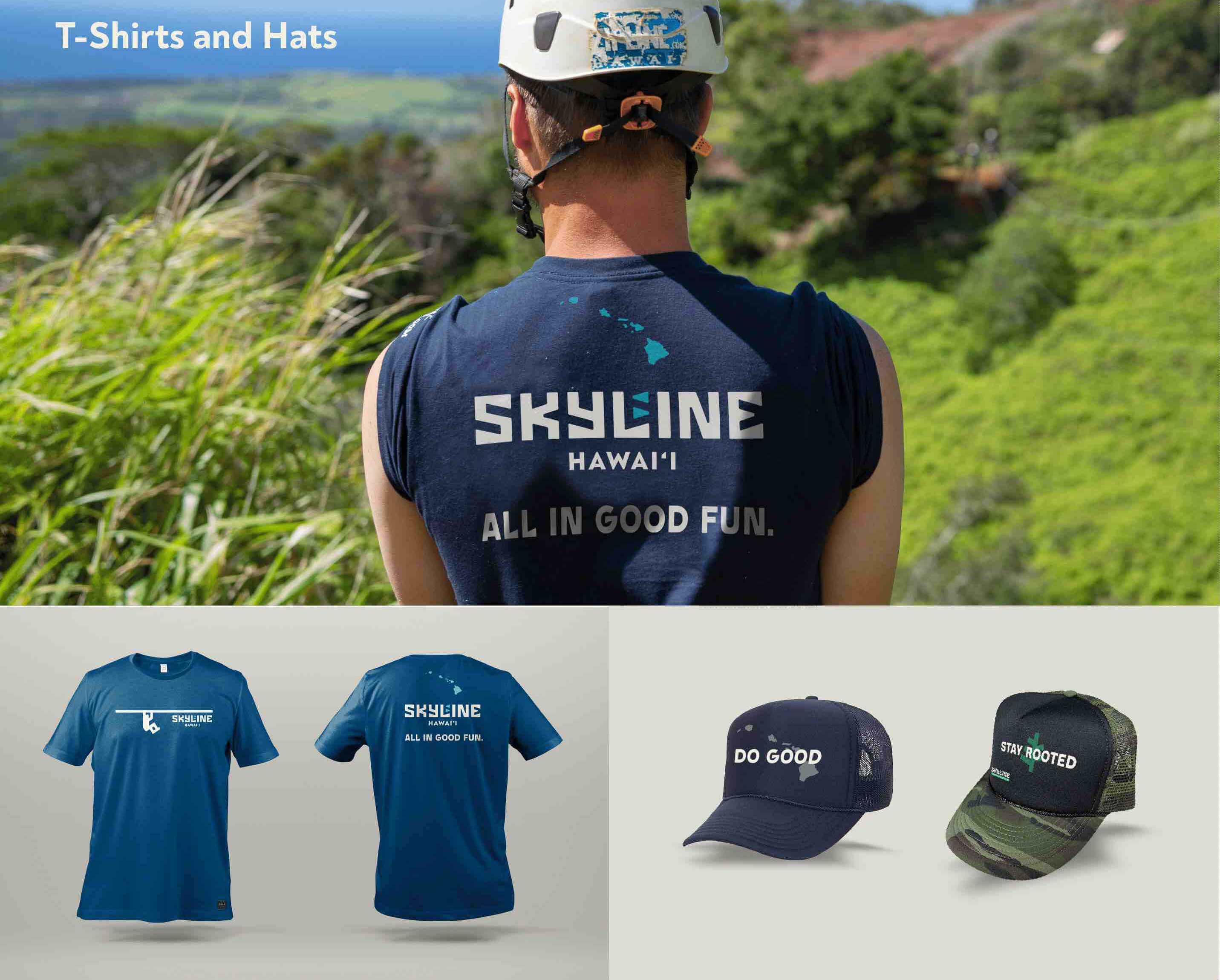
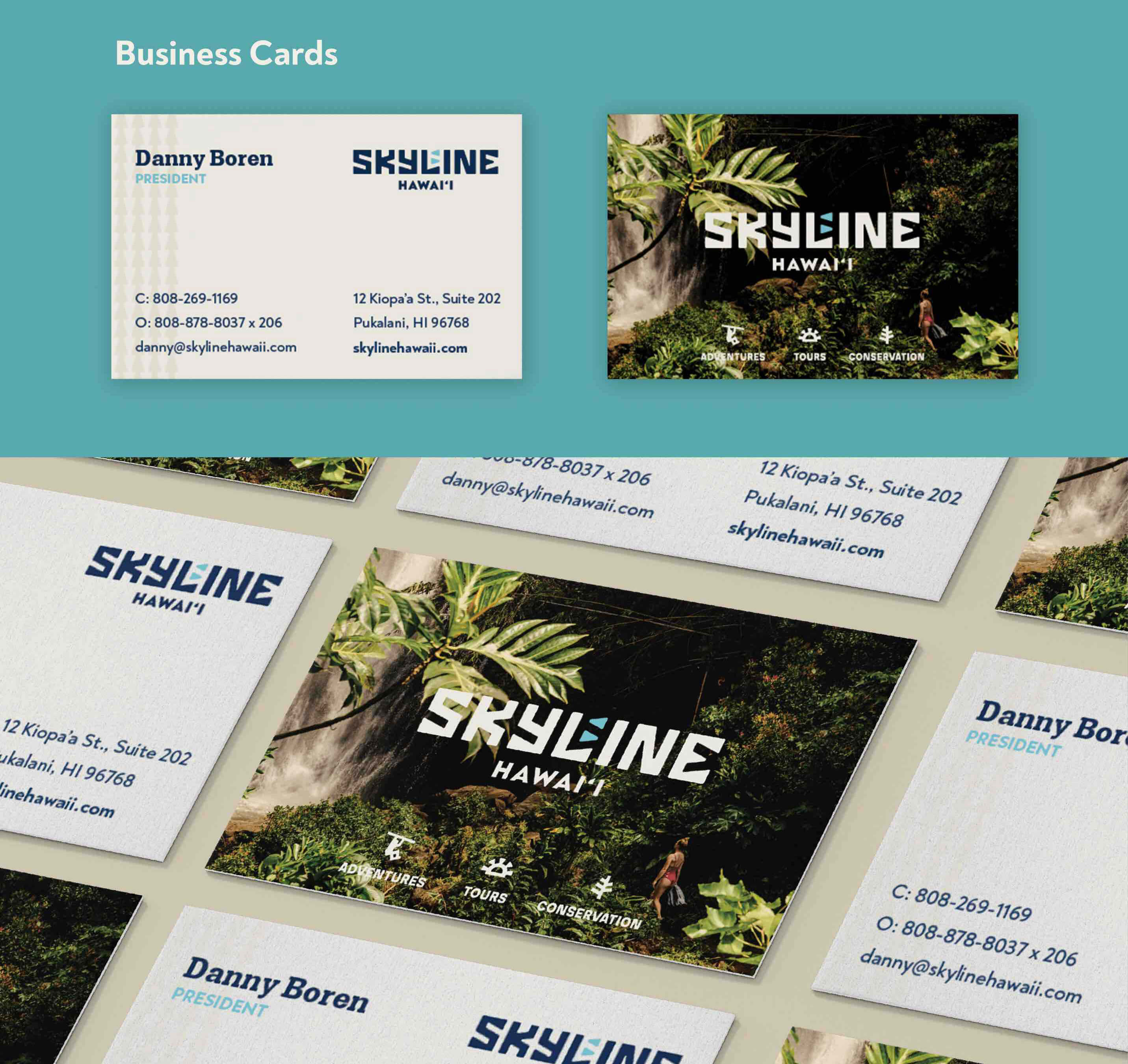
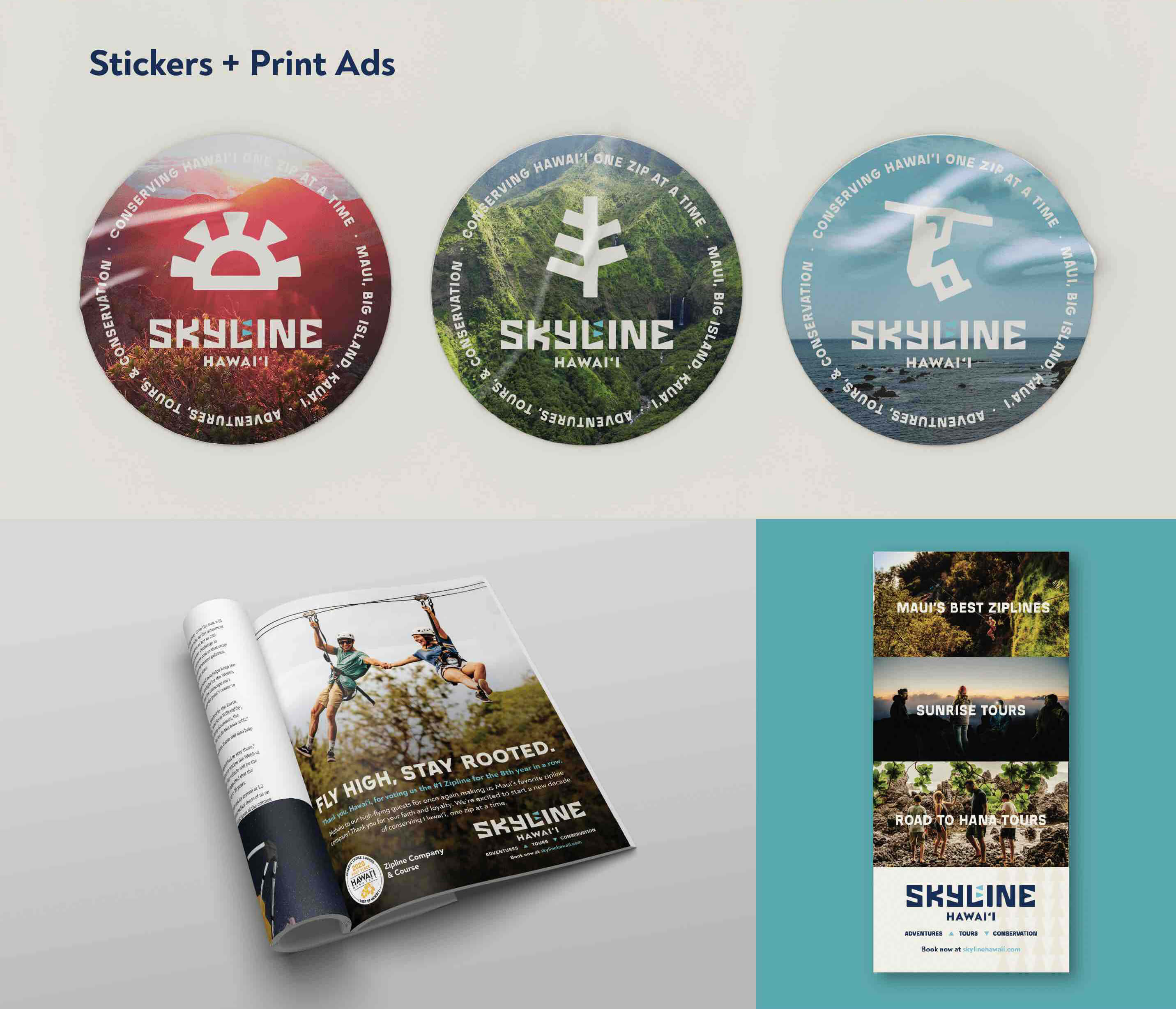
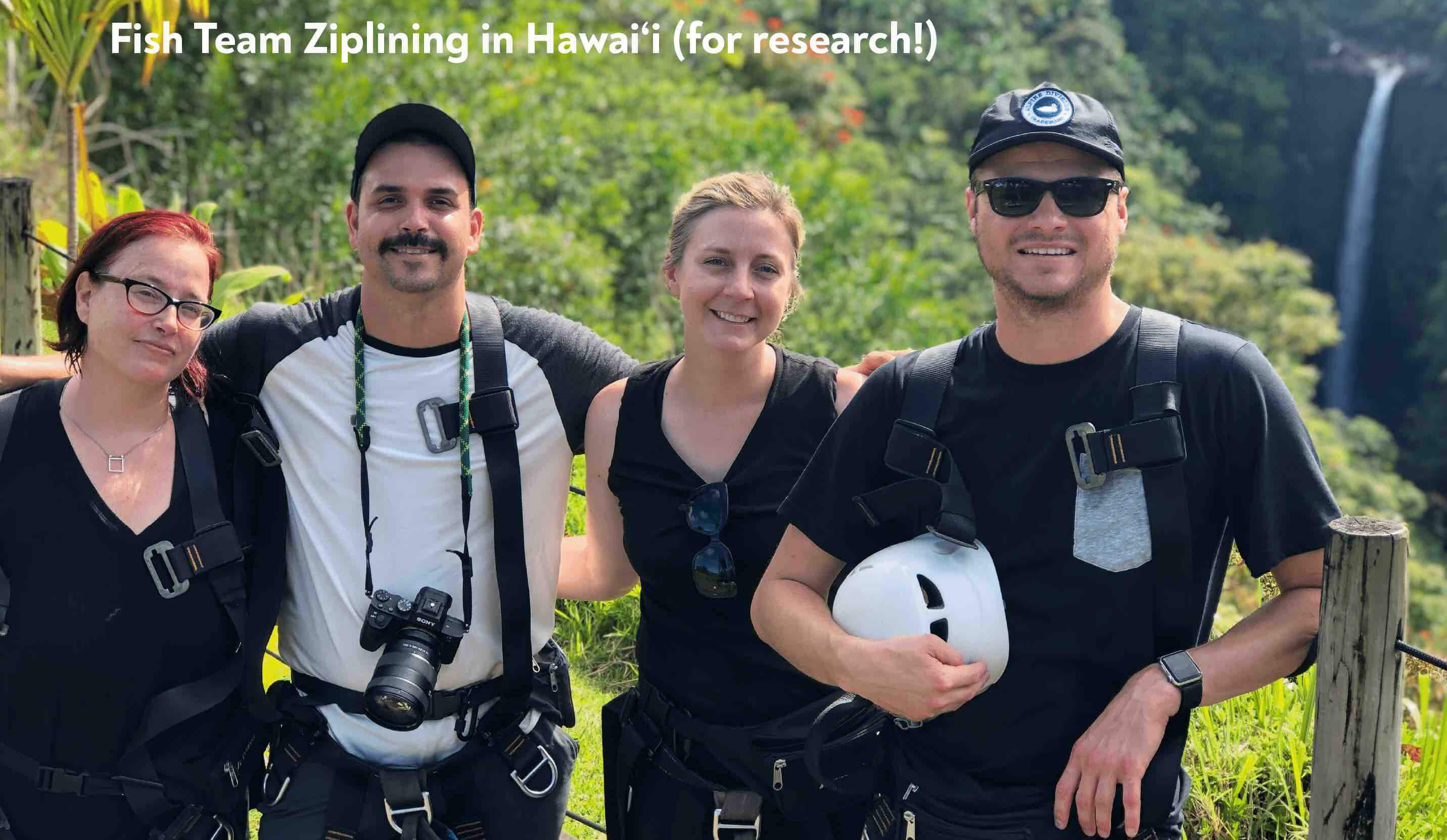
Skyline is the highest-rated zipline experience in Hawai’i, as well as the first commercial zipline company in the country. After beautiful rebrand work from DTTB that included a new logo, photos and iconography, they looked to us to utilize that new brand to create a new website, collateral, merchandise, and print ads. At FISH, we take brand stewardship seriously, so we met for a full day with the DTTB folks to figure out how to properly utilize their work. We also spent six days ziplining, touring and learning about Skyline’s conservation efforts in Hawai’i (not a bad work week, guys). And because those conservation efforts affect everything they do, that meant using only recycled paper and eco-friendly ink on their collateral and merch. The result was cohesive new work that was truly connected to Skyline’s company mantra: Do good. Have fun.
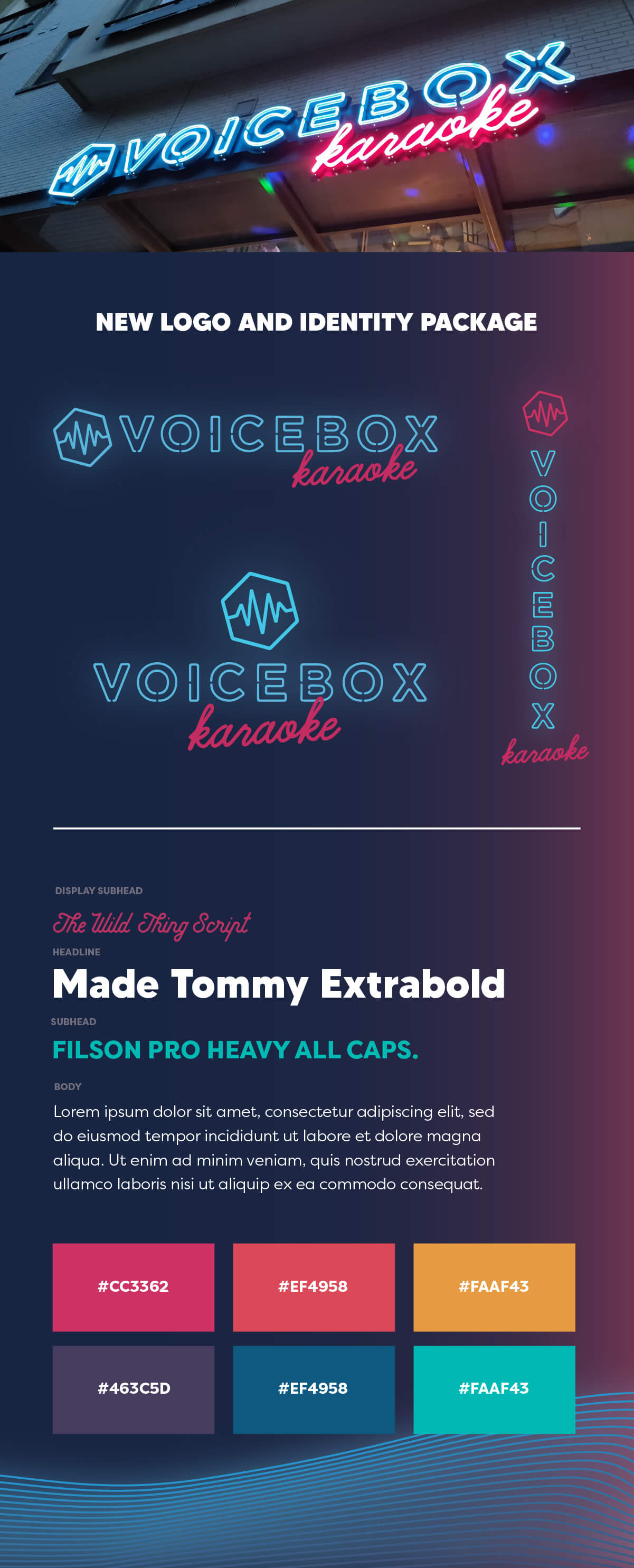
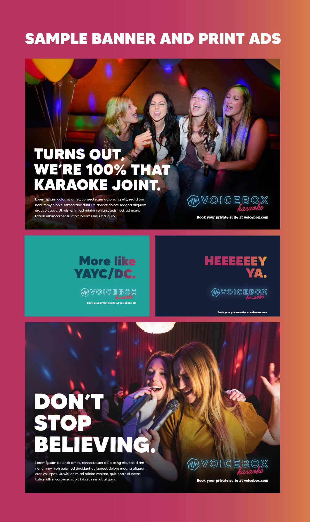
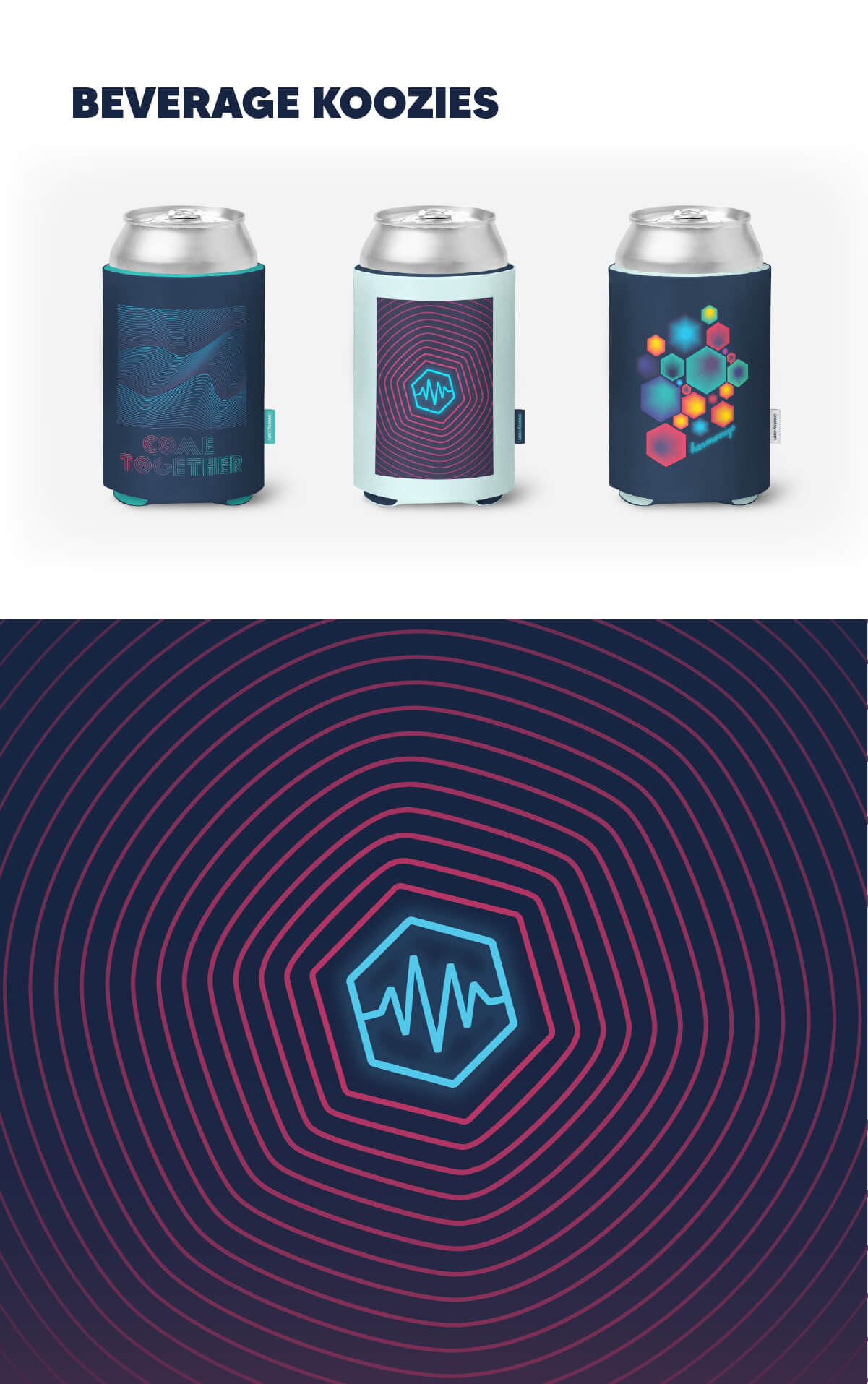
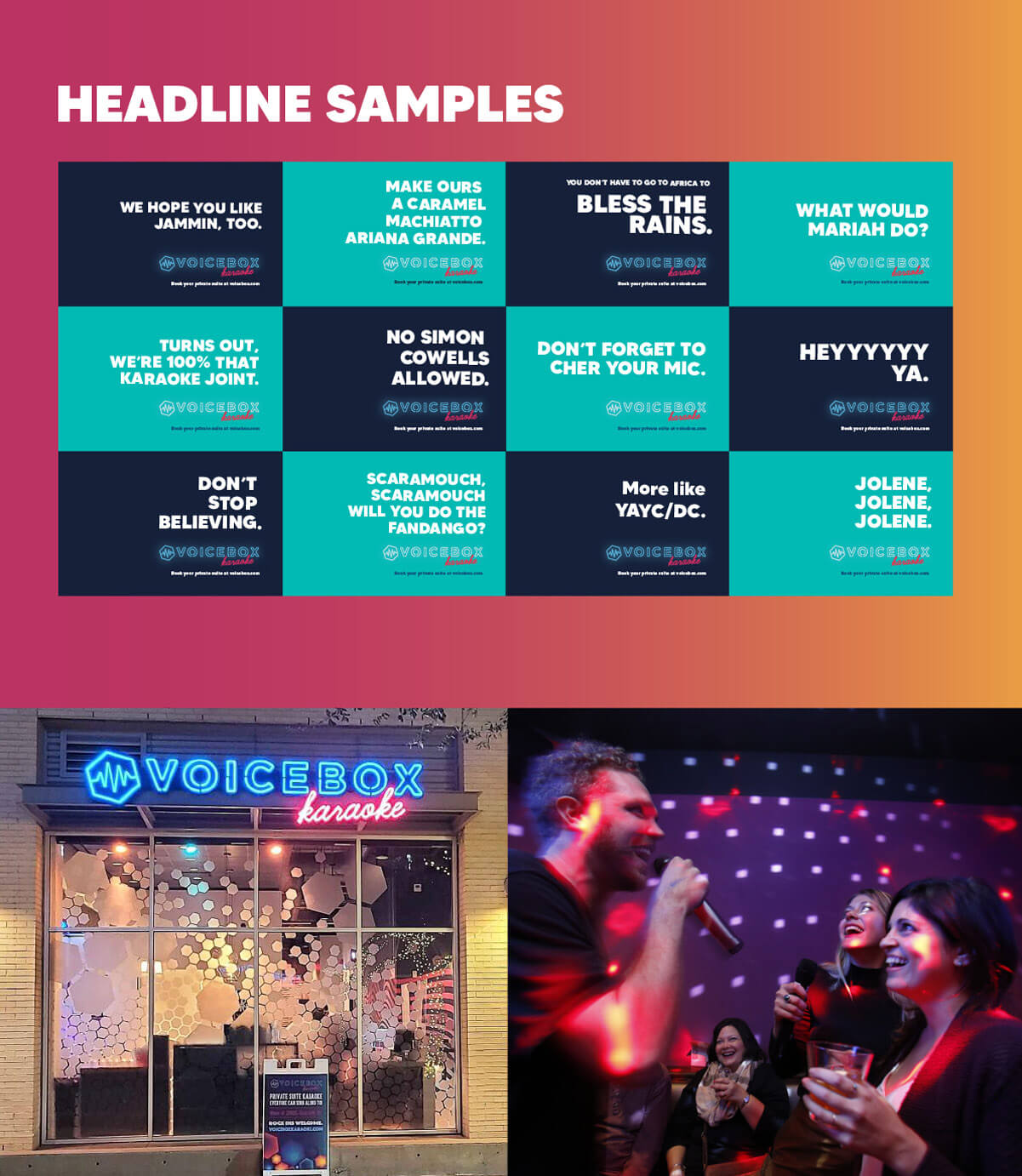
Sometimes you don’t know what you need until you see it. Voicebox is a small chain of Japanese-style private suite karaoke bars based in the Northwest. When they were expanding to Boise and Fort Worth, they hoped to standardize the artwork on their walls to make the experience cohesive no matter the location you visited. We designed modern new wall art that hinted at sound waves. When we presented that work, we also presented them with a new, more modern logo that was more in line with the wall art; one with a neon feel that was far more evocative of a night spent belting out the hits of your lifetime with friends. The client loved it and it now graces the storefronts at their Boise, Fort Worth and Denver locations.

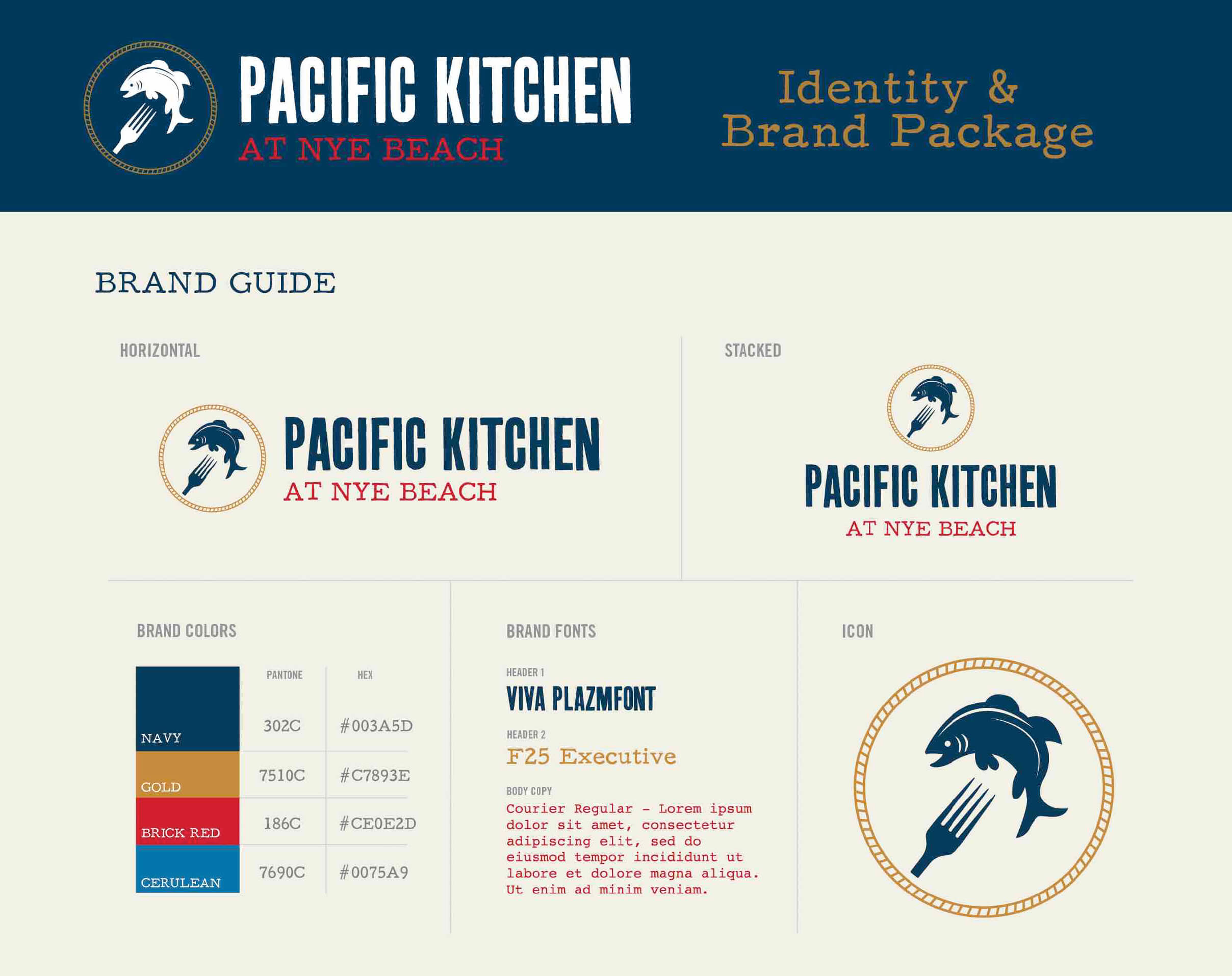
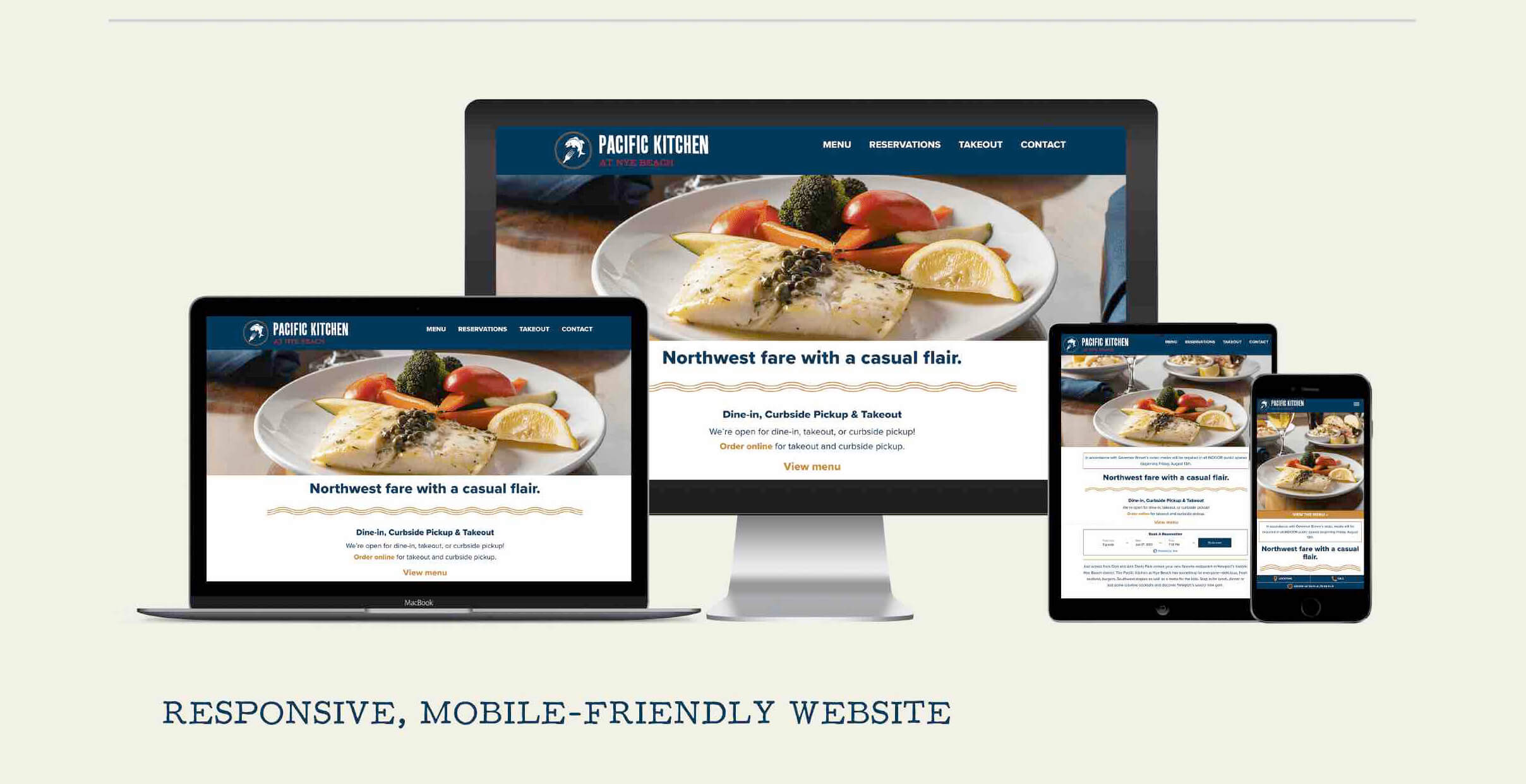
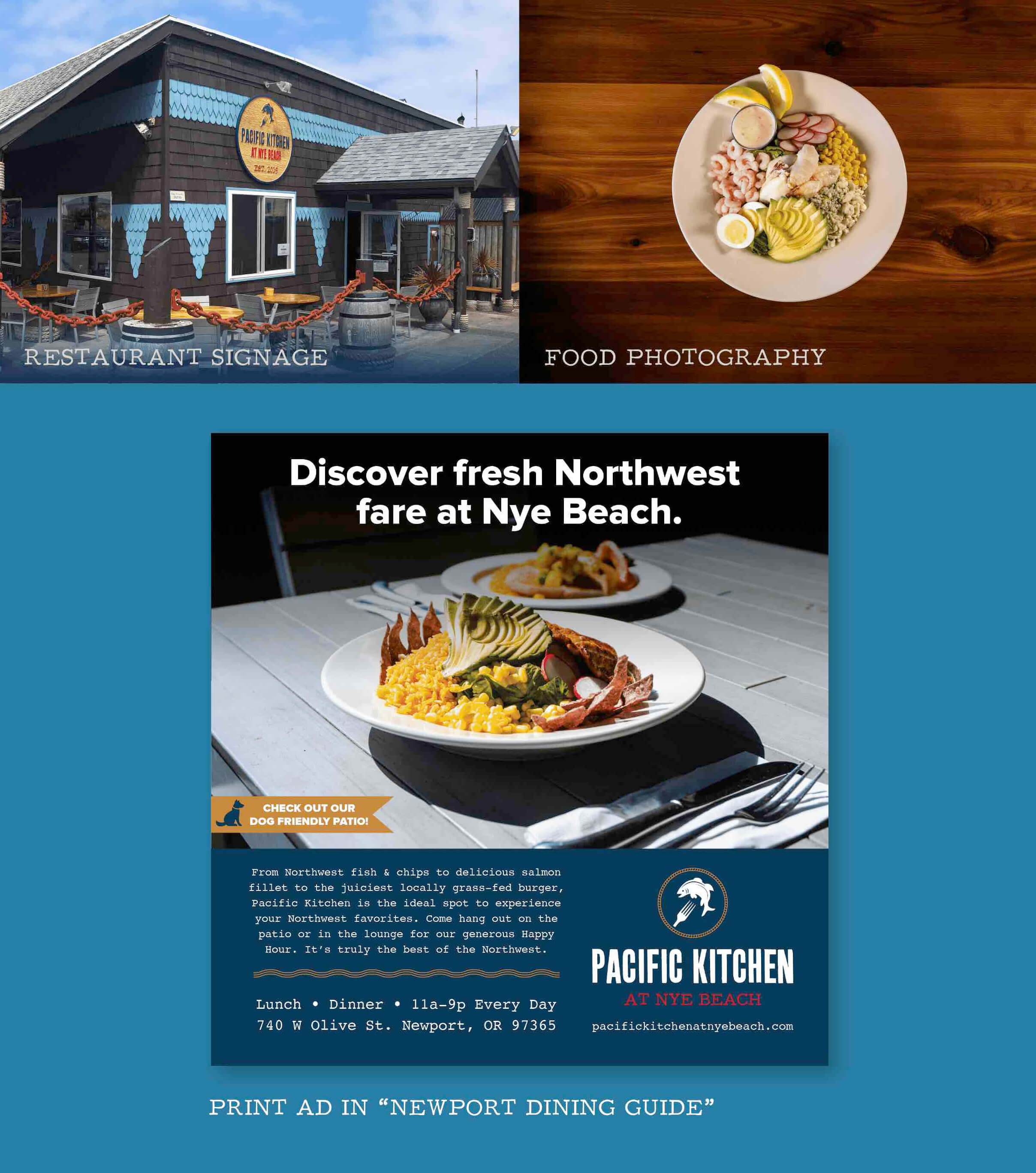
Hallmark Resort Newport was opening a new restaurant in Nye Beach and needed a brand identity and website to highlight their fresh take on Northwest fare. We began with a name—Pacific Kitchen—and an identity package. Their logo needed to fit in with some super cool nautical murals inside the space, and we wanted their identity to mirror the experience: coastal, fresh and fun. Our goal with their website was to keep it clean and simple—most people visiting a restaurant’s site are looking for a menu, hours and a vibe. And since we knew that 89% of dining research is done on a mobile device, our first priority was making the site responsive and mobile-friendly, with sticky footers to keep all the important information available no matter which page you’re on. The result was a user-friendly, quick-loading site that allowed users to access what they needed fast so they could experience the Diablo Bites as soon as possible.
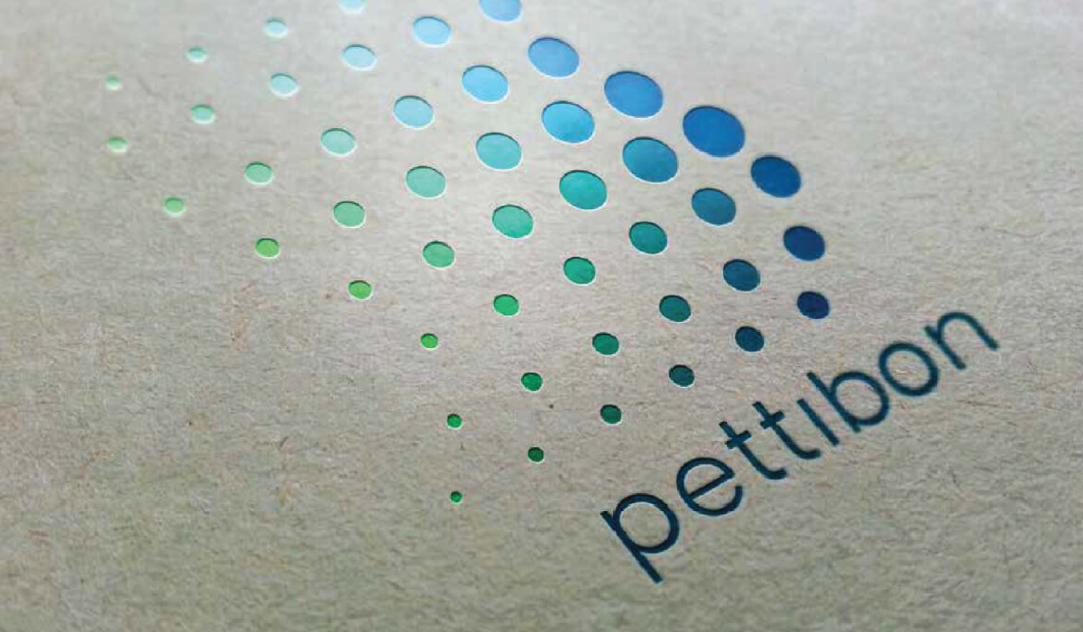
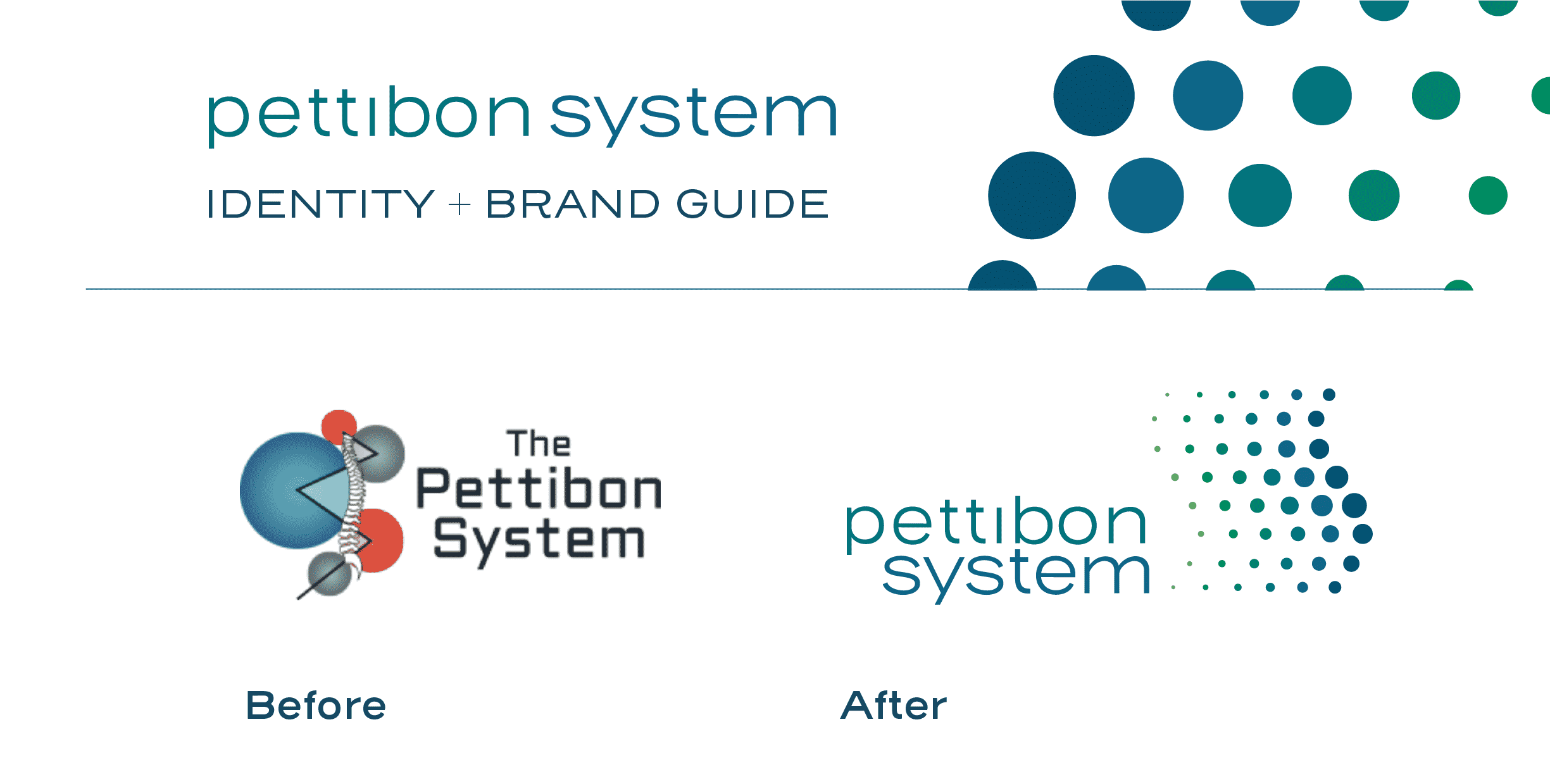
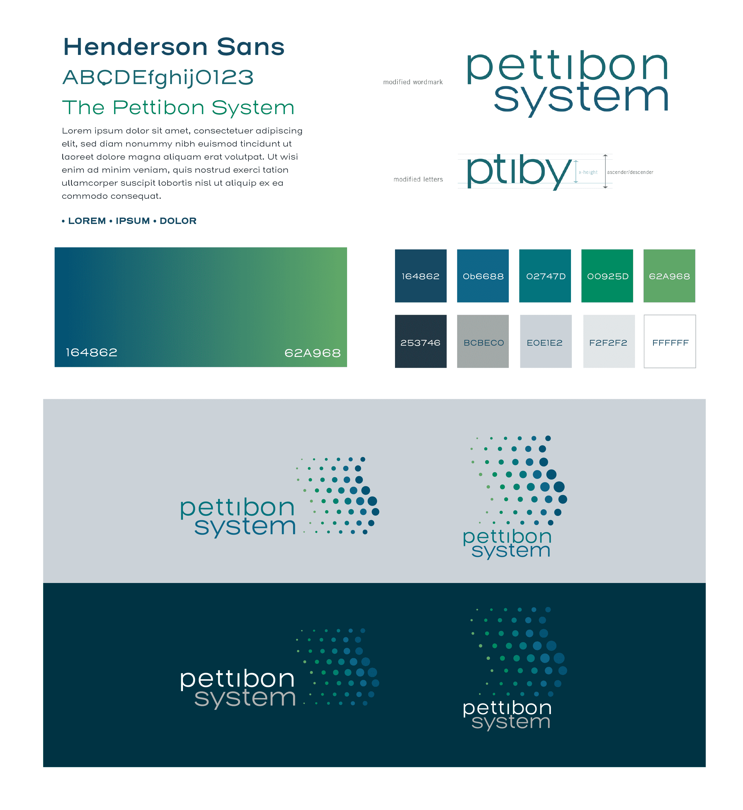
Pettibon is a system of rehabilitation products that offer permanent solutions to those suffering from back pain. They approached us to create a new, more modern logo that conveyed mobility and a feeling of healing and recovery. Utilizing greens and blues to project a sense of balance and calm, the new logo mirrors the shape of a healthy spine and symbolizes the freedom of movement Pettibon systems can offer their clients.

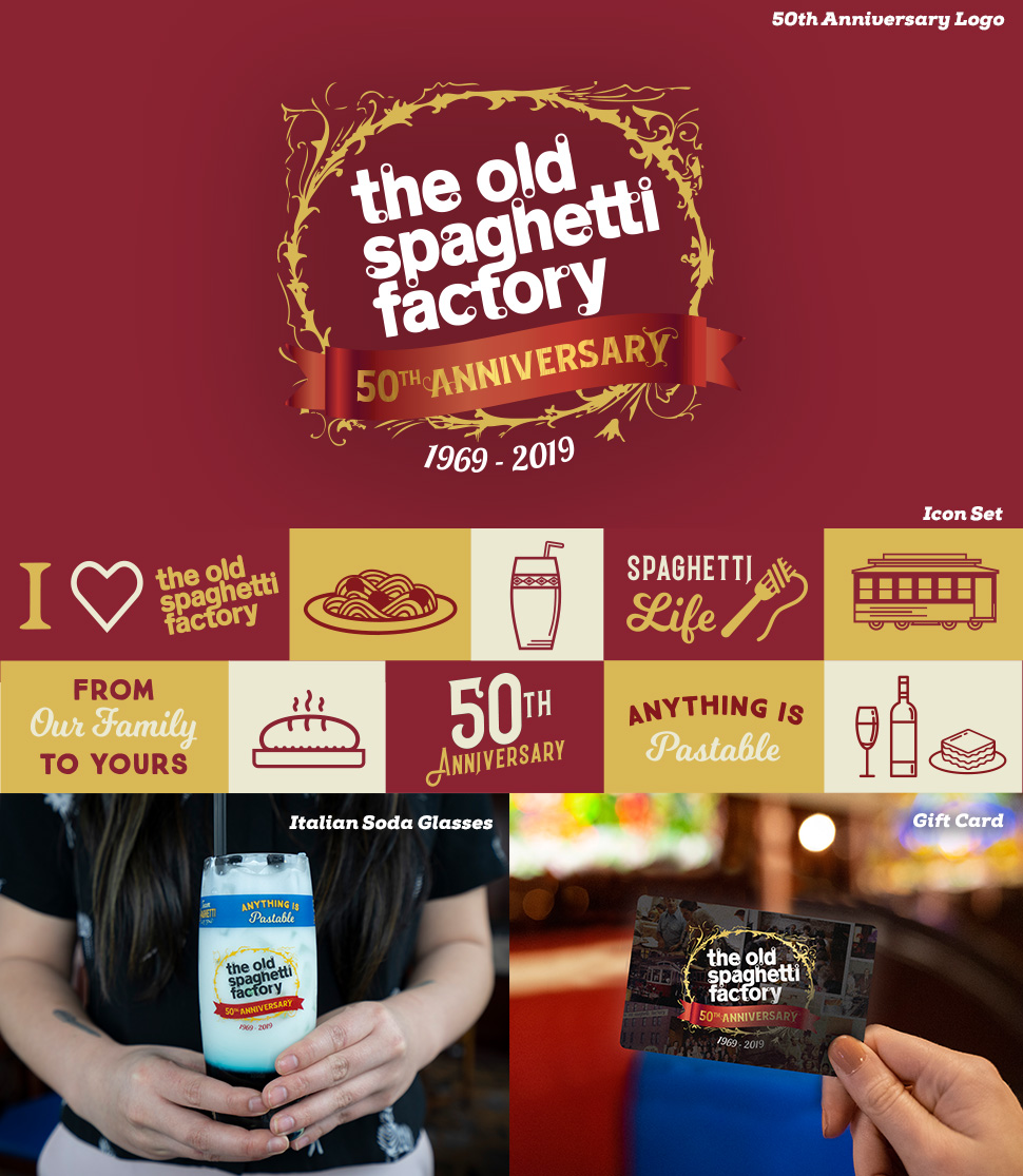
The Old Spaghetti Factory was started in 1969 by Gus and Sally Dussin. To celebrate 50 years and 42 locations, this Portland-based, family-owned restaurant group hired Fish to help them create a year-long campaign to tell their brand story, engage their customer base and drive sales.
